Tactile Wireframing
Introduction
Designing for our highly technical domain can result in pretty complex patterns. Just take a look at all the data modifications we needed to accommodate in this table.
Now, imagine what it’s like to navigate this table with a vision impairment, where your only cues for what is happening are given through sound.
We learned about screen readers by working with our teammate, Randy, who has a vision impairment. Randy is a dev manager who often reviewed our work to communicate instructions to his team.
Randy taught us that people with vision impairments use screen readers, like JAWS, to engage with websites and applications. Watch this video to experience what that feels like when Randy talks to our other teammate, Steven, over Slack.
This is the conversation that you just heard:
Steven: Hey, Randy. How’s it going?
Randy: Going well, except that Slack has labeled the message box “search.”
Steven: Haha well it’s good to see some of those issues for the accessibility talk today.
Randy: Do we have new designs to review?
Steven: Yeah pretty soon we will be ready. We wanted to schedule a meeting soon. When are you available?
Randy: One thing with Slack is that it does not read your new messages when they arrive.
Steven: Yeah, I am beginning to notice that.
Randy: Ok. Thanks for getting in touch. Talk soon.
Did you find it hard for you to follow along with the robotic screen reader voice? Now imagine how difficult it would be to not only interact, but edit one of those complicated tables when you only have auditory cues for guidance.
The problem
When Randy used JAWS to evaluate this page our team had designed, he identified some serious accessibility issues.

The complexity of the nested editing patterns was inaccessible via keyboard navigation.
The dev team needed to use many ARIA tags to compensate for accessibility issues.
Reading high level information from the table required a lot of steps.
At this point in time, JAWS only worked on live code. Paradoxically, this meant that Randy (and other visually impaired folks like him) could only give us that feedback after our designs had been developed. By that time, changes would require extensive code refactoring, which would increase company expenses and delay improvements.
When Randy was able to give us feedback, products were halfway out the door.
Problem statement
How can we better incorporate accessibility into the design process so we can enable those with visual impairments to provide actionable feedback earlier in the process?
Personas
We based our personas off of our own experiences in this process, with “Martin” representing Randy’s role, “Desi” representing our role as designers, and “Tonya” representing the developer at a fictional company called CloudLand.

Martin, Dev Manager
Has a background in web development and now manages a team of developers for CloudLand, a cloud computing company.
Lives with vision impairment and is assisted by a guide dog.
Accessibility advocacy is not his primary responsibility.
Uses screenreaders to give feedback to devs and design teams.

Desi, UX Designer
Creates wireframes and Invision prototypes to explain interactions to her development teams
We included Desi as a persona because we need this solution to be easy for both parties to use. A communication tool that’s useful for only one person is useless.

Tonya, Developer
Front-end developer on Martin’s team.
Iterates with Desi and the design team to create coded, production level experiences.
Primary concerns are around a release being functional, accurate to designs, and on time.
Pain points
Together with Randy, we examined our processes to see where we ran into problems and identified these as opportunities to improve the communication between Martin and Desi.
Martin cannot give feedback until later stages of development, meaning his input often goes unaddressed.
Desi cannot get Martin’s feedback on accessibility because her designs must be coded before he can use a screen reader to evaluate them.
Tonya has to spend significant time refactoring designs to account for accessibility issues.
Co-creating a solution
We were fortunate enough that our main user was someone who sat just a floor above us, so we worked with him to co-create a solution.
We asked Randy what we could do to help him be involved earlier in our process. He said something that resonated with us:
“I wish I could engage with our wireframes before they ever became live code.”
Research
We started our exploration by evaluating the existing digital tooling that helps express designs to those with visual impairments.

One option would be a high level developed prototype. However, that would require a good amount of time and technical knowledge and would not support an iterative process for a team.

There were also some tools like “Stark,” which is a Sketch plugin that tests for accessibility. However, this tool only applied to color contrast and text sizes.

There were also a number of guidelines that include checklists for designers and developers, but these don’t help someone with limited sight get an impression of static design. They are also not tools that designers and developers can integrate into their process.
We then explored some physical tools like 3D printers and embossers. However, we found that tools like these either take a significant amount of time to produce componentry or are exorbitantly expensive.
One tool that did show promise was this “raised line drawing kit.” This kit includes a rubberized surface, plastic sheets, and a stylus. using the stylus and plastic against the soft surface creates raised lines that a person with a vision impairment can explore with their fingers. We were curious if the solution was as simple as sketching wireframes on this plastic.

After researching these different tools, we decided that we should proceed with a physical medium. We brainstormed and referenced our roots making paper prototypes.
What if we made tactile wireframes and used different shapes and textures to represent different UX patterns?
Our tactile wireframing kit needed to be inexpensive, fast to iterate with, and easy for someone like Martin to work with.
Round 1: Material exploration
Where does any good “tactile” journey start? We headed to Michael’s and touched as many products as we could find.

Our team assembled a robust variety of materials, all with different textures and feels—everything from hot glue to slick stickers to scratchy tape.

As we gathered supplies, we repeatedly tested them with Randy to help guide what wasn’t working and what was.
Through these sessions, we realized a couple materials like the puffy paint weren’t going to work. But, the glossy stickers, tape, and hot glue gun lines worked pretty well so we kept working with those supplies.

We also worked with the raised line drawing kit to see how Randy liked it compared to actual physical shapes and materials. We found that the raised line kit was easier for drawing really detailed micro interactions and the shapes and textures were better for communicating a macro view of layout and flows.


Findings
Puffy paint didn’t work because it had to take too long to dry.
Modeling clay was too fussy and didn’t retain shape well.
The tape strips worked well, though, and we were impressed to learn how sensitive Randy’s fingers were to nuanced textures.
The raised line drawing kit was more helpful for detailed micro interactions, rather than lower fidelity flows.
Round 2: Creating a pattern library
We iterated on the materials so we could build out a variety of common UI components like dropdown menus, tables, and buttons. We wanted to see how these materials could be used to represent components on pages that are live in product.
Since these pages were already live, Randy had already used a screenreader to engage with the product so he could give us better feedback on how textures could communicate different interactions to him.

We printed out pages from our product suite and physically attached our component prototypes on the paper. Then we asked Randy to read the wireframes with his fingers—the same way he would read braille. This process helped us figure out what were the most effective ways to physically represent digital components.
After multiple rounds of iterations, we co-created a textured legend. Randy could keep this handy as he engaged with our tactile wireframes.

Findings
Randy liked the idea of a shape feeling like the actual component it represents. A foam rectangle felt like actually pushing a button.
Creating braille labels was too time intensive to incorporate into the kit. However, engaging with this process helped us further empathize with how people with vision impairments engage with the world.
Next, we needed to use the standardized components we created to recreate another existing product page to ensure that our symbols consistently worked.
Round 3: Making a reusable kit
In this phase, we focused on finding a way to make this kit scalable and reusable to save time and money.
In prior iterations, we created more permanent designs by gluing and taping materials onto the page. We weren’t able to reuse the materials as they were permanently attached, so each page required time to gather materials together to assemble the wireframes.
In order to scale the kit and save time, we needed to find a way for the kit to be reusable.

We first needed to figure out how we could make the tape and glue elements reusable. We tried velcro as a way to attach the individual components, but the rough surface introduced a new variable texture for a blank canvas. We didn’t want to complicate our communication with a potentially distracting texture. Instead, we sought a neutral base surface that wouldn’t overpower the textures of the components.
We ended up using a magnetic whiteboard as the neutral surface. We had easy access to whiteboards in the office and we could attach the components to the whiteboard with magnets.

We iterated through several kinds of magnets to check the strength of attachment to the whiteboard. If it were too weak, then the materials would shift when interacted with. We used bass wood as the structure of the component due to its thin, lightweight, and sturdy composition.
Using all of our successful materials, we recreated all of the UX components we needed to build out our kit.
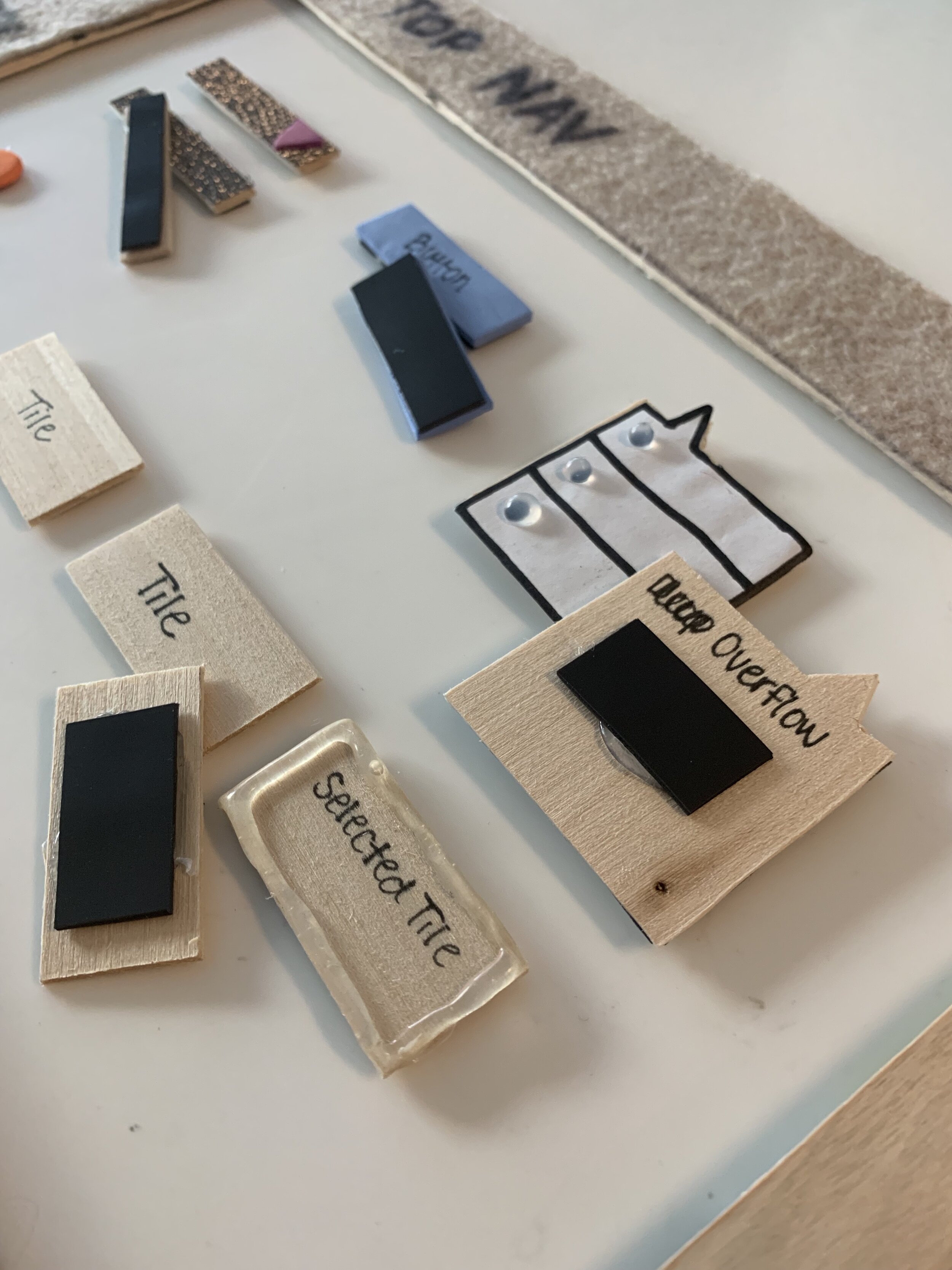
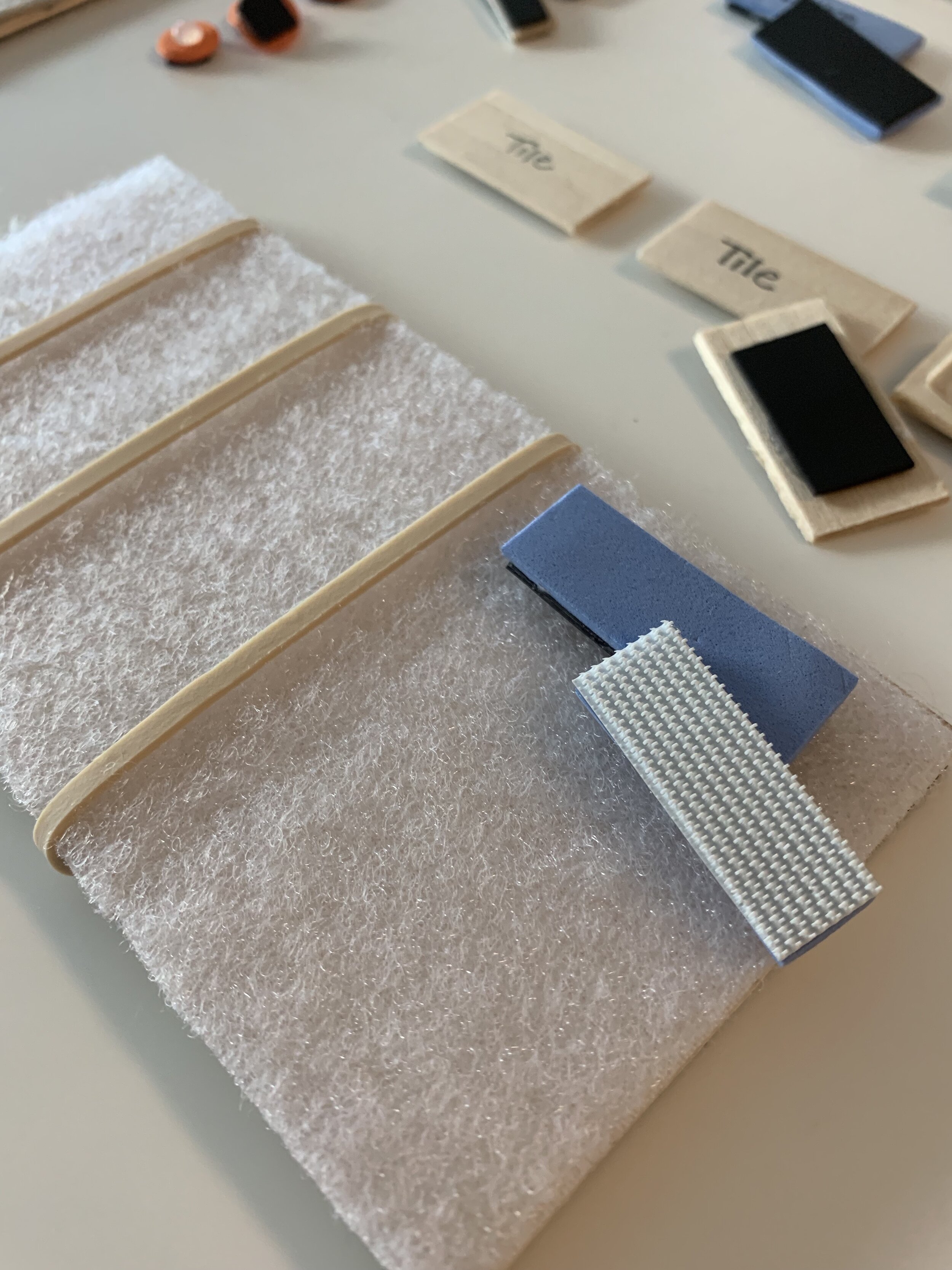
Here is what our kit mostly looks like today. We have lent it to other teams to test their concepts for accessibility and planned to continuously iterate on our components.


Round 4: Putting it to the test
We used our kit with Randy to iterate on the complex tables that we account for in our UI.
At the time, Michelle, a designer on our team, had been working on a new side panel component to replace our inline editing functionality since it was not accessible. Since this was a new pattern we were introducing, we thought it was the perfect opportunity to harness our tactile wireframing kit.

Randy and two developers on his team used our kit to provide feedback to Michelle’s latest designs for this new component.
In the room, Michelle displayed her designs onto the screen for our sighted developers and used the tactile kit for Randy to understand what was being discussed as she walked through her flows. Michelle was actually able to build the tactile wireframes on the spot and printed out designs as a helping guide to build them.

Randy was able to easily understand the layout of our pages along with the other developers in the room and provide feedback at an actionable point in our process.
“I feel like I’m finally able to give useful feedback.”
Randy provided plenty of meaningful suggestions to us and directions to his development team. These points would have come up when he reviewed the code using JAWS, so our team was able to get in front of these problems to more meaningfully craft our experiences.
Summary
We spoke about this work at several conferences worldwide, including Big Design in Dallas and A11y Camp in Sydney. At A11y Camp, we were also able to share the physical kit with vision impaired attendees to get their thoughts. Not only did sharing this experience give us the opportunity to learn from a greater audience of differently abled users, we were also able to evangelize accessibility considerations more loudly in our own org.